Earth Tone Color Palette: 10 Inspiring Ideas for a Calm, Natural Look
The Earth Tone Color Palette is more than just a trend—it’s a design philosophy rooted in nature, offering a calm, natural look that resonates with both aesthetics and emotional well-being. As the world becomes increasingly fast-paced and artificial, earth tone color palette inspiration provides a soothing alternative, drawing from the hues of soil, foliage, and stone to create spaces that feel grounded and organic. This article explores 10 inspiring ideas to apply an earth tone palette in interiors, fashion, and even digital spaces, while uncovering the psychological and cultural significance behind these colors. Whether you’re designing a room, planning a wardrobe, or creating a website, understanding the nuances of an earthy color scheme can transform your space into a sanctuary of tranquility.
The Essence of Earth Tones: A Timeless Connection to Nature
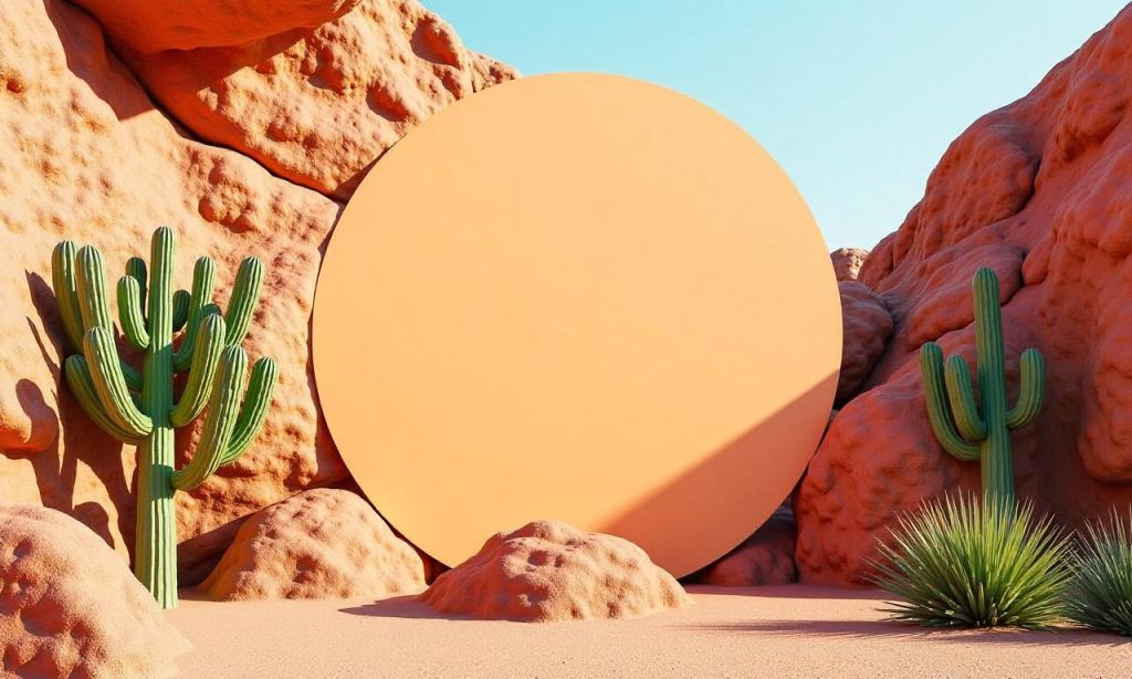
Earth tones are derived from natural elements like earth, wood, and stone, evoking a sense of stability and serenity. These colors—ranging from muted greens and warm browns to soft beiges and deep ochres—mirror the textures and gradients of the natural world, making them ideal for environments that prioritize comfort and simplicity. Unlike bright, synthetic colors, earth tones work harmoniously with light and shadow, allowing spaces to breathe and feel uncluttered. Their subtle variations also make them versatile, as they can adapt to different moods and functions, from cozy living rooms to serene bedrooms.
How to Use Earth Tones in Interior Design: From Walls to Textures
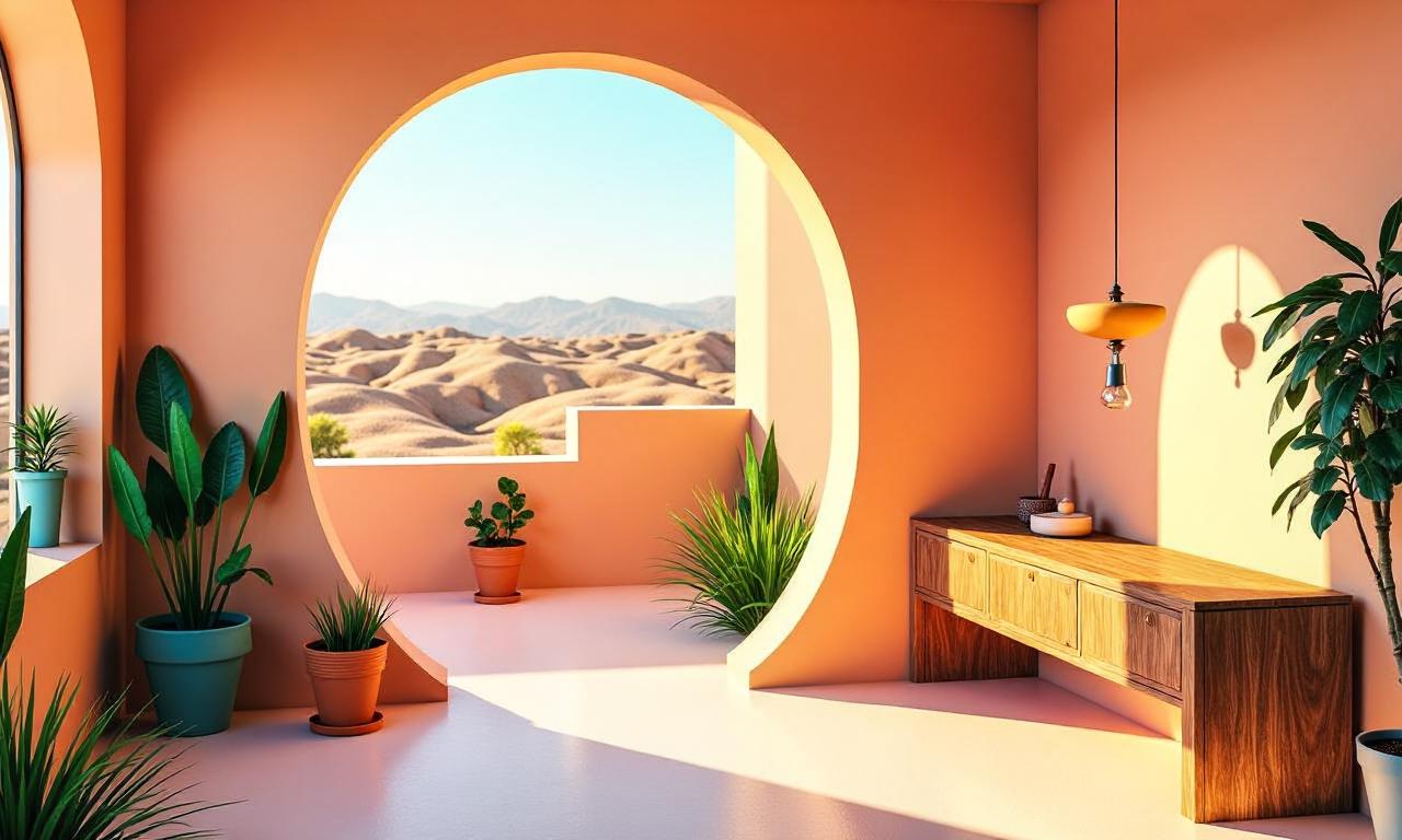
Applying an earth tone color palette inspiration in interior design requires balancing warmth and neutrality. Start by choosing a base color, such as soft beige or pale gray, then layer in muted greens or terracotta for depth. For example, a living room with earthy tones might feature a sage-green sofa paired with a cream-colored rug and wooden accents, creating a visual rhythm that mimics natural landscapes. Don’t forget textures—think rattan, linen, or cork—to add dimension without overwhelming the palette. This approach not only enhances visual appeal but also supports mental health by reducing visual stimulation.
Earthy Color Palettes for Fashion: Earthy Looks That Feel Authentic
In fashion, an earth tone color palette inspiration can elevate outfits with a natural, effortless vibe. Opt for muted shades like olive, rust, or sand, which pair well with neutral basics like white or black. A simple example is a rust-colored sweater with a denim jacket and beige trousers, which feels grounded yet stylish. For a more dramatic look, combine deep terracotta with olive green for a bohemian twist. The key is to use these colors to reflect the wearer’s connection to the environment, whether through a minimalist capsule wardrobe or a seasonal outfit inspired by nature’s palette.
Psychological Benefits of Earth Tones: Why They Calm the Mind
Studies show that earth tone color palette inspiration reduces stress by mimicking the calming effects of nature. Colors like soft greens and warm browns are associated with growth, stability, and comfort, making them perfect for promoting relaxation. In Islamic culture, the use of natural colors like green (symbolizing paradise) and brown (representing the earth) aligns with the concept of Taqwa—a spiritual awareness that fosters inner peace. This connection makes earth tones not only visually appealing but also emotionally resonant, offering a sense of continuity with the natural world.
Creative Applications Beyond Home: Earth Tones in Art and Digital Design
An earth tone color palette inspiration isn’t limited to physical spaces. In art, earthy tones can evoke a sense of antiquity, as seen in the work of artists like Georgia O’Keeffe, who used muted hues to highlight natural textures. For digital design, earth tones provide a soothing backdrop for content, especially in wellness or eco-friendly brands. A website with a terracotta header, olive-green navigation, and beige accents feels inviting and trustworthy. This versatility ensures that earthy palettes can be applied to any medium, from print to screens, without losing their organic essence.
10 Inspiring Ideas to Master the Earth Tone Color Palette
1. Interior Walls: Use warm beige or soft terracotta for walls to create a sunlit, open feel. 2. Furniture Accents: Add a rustic wooden coffee table or a woven basket to anchor the palette. 3. Textured Fabrics: Layer linen curtains with a sand-colored rug for a tactile, grounded look. 4. Plant Life: Pair muted greens with neutral tones to mimic a living room garden. 5. Flooring: Choose natural stone or clay tiles for a subtle, earthy foundation. 6. Lighting: Opt for brass or copper fixtures to add warmth without overpowering the palette. 7. Artwork: Display abstract paintings with earthy gradients to complement the room’s vibe. 8. Seasonal Updates: Swap out accessories for autumnal hues like deep ochre or burnt umber during colder months. 9. Minimalist Spaces: Stick to three earth tones for a clean, cohesive design. 10. Personalized Touches: Use natural materials like clay pots or stone vases to add warmth and texture.
Earth Tones and Sustainability: A Holistic Design Approach
Sustainability is a growing concern in design, and earth tone color palette inspiration naturally aligns with eco-conscious values. These colors often come from low-impact, organic materials, reducing the need for synthetic dyes and harsh finishes. For instance, a home using reclaimed wood and earthy paints reflects a commitment to environmental stewardship. In Islamic teachings, Surah Ar-Rum (30:40) emphasizes the importance of harmony with nature, making earth tones a fitting choice for those who value sustainability and simplicity. This connection between color and ethics adds depth to their appeal, offering more than just visual beauty.
Balancing Earth Tones: Avoiding Monotony with Contrast
While earth tones are inherently soothing, they can feel static if not balanced properly. To prevent monotony, introduce contrast through small pops of color or metallic accents. For example, a soft green room can be energized with a touch of deep blue or a red pillow, adding visual interest without disrupting the palette’s calmness. In Islamic design, the use of contrast in color is often intentional, as seen in the interplay of white and blue in traditional tilework, symbolizing purity and serenity. This approach ensures the palette remains dynamic and engaging.
Earth Tones in the Modern World: Trends and Timelessness
Despite their timeless appeal, earth tones have seen a resurgence in modern design, blending vintage charm with contemporary minimalism. This trend is fueled by a desire to escape the brightness of urban environments and reconnect with nature. For example, brands like Eileen Fisher and Mango have popularized earthy color schemes in their collections, appealing to consumers seeking simplicity and sustainability. The key is to embrace these tones without sacrificing style, proving that calm, natural looks can be both sophisticated and approachable.
FAQ: Answering Common Questions About Earth Tone Color Palettes
Q: How can I incorporate an earth tone color palette inspiration into my home without it feeling too rustic? A: Start with a neutral base and add subtle earthy accents, like a olive-green vase or a terracotta rug, to maintain modernity while keeping the palette grounded.
Q: Are earth tones suitable for small spaces? A: Yes, they work well because their warm, muted tones create a sense of openness and lightness, making spaces feel larger and more inviting.
Q: What are some tips for mixing earthy colors effectively? A: Focus on color harmony by selecting shades from the same color family, like variations of brown or green, and balance them with metallics or whites to avoid heaviness.
Q: Can I use earth tones in a high-traffic area like a hallway? A: Absolutely. Pair neutral earth tones with durable materials like concrete or stone to ensure both aesthetic and functional appeal.
Q: How do earth tones affect mood compared to other color schemes? A: Earth tones are known to reduce stress and promote calmness, making them ideal for spaces where relaxation is key. They also create a sense of continuity, which can enhance mental well-being.
Q: What are some examples of earth tone color palette inspiration in popular culture? A: Earth tones have been featured in minimalist interior design trends, sustainable fashion campaigns, and even in the branding of eco-friendly companies, showcasing their versatility and timelessness.
Beyond Aesthetics: The Cultural and Spiritual Significance of Earth Tones
Earth tones are more than just a color trend—they carry deep cultural and spiritual meanings. In many traditions, these colors symbolize the earth, which is seen as the foundation of life and stability. For example, in Islamic art, green represents paradise, while brown reflects the soil that sustains humanity. This symbolism makes earth tones a powerful choice for those seeking calm, natural looks that resonate on a deeper level. Additionally, their association with nature can foster a sense of mindfulness, encouraging people to pause and appreciate their surroundings.
Earth Tones and the Power of Simplicity: A Design Philosophy
The appeal of an earth tone color palette inspiration lies in its simplicity. Unlike flashy, high-contrast color schemes, earth tones prioritize balance and ease, allowing the eye to rest. This philosophy is especially relevant in today’s world, where overstimulation is common. For instance, a bedroom with a soft beige wall, a muted green canopy, and warm wooden furniture creates a serene environment that promotes rest. The key is to let the colors speak for themselves, avoiding unnecessary embellishments that can detract from their natural charm.
How to Customize Earth Tones for Different Spaces and Moods
Every space has its own personality, and an earth tone color palette inspiration should reflect that. A living room might benefit from a rich terracotta accent wall, while a study could use soft sage greens for a calming effect. For example, a spa-like bathroom with a pale stone countertop and warm towels creates a spa experience. Similarly, a workplace with an earthy palette can improve focus and reduce anxiety. Customizing the palette based on the space’s purpose ensures that it serves both function and beauty.
The Future of Earth Tones: A Sustainable and Mindful Trend
As the world shifts toward sustainability and mindfulness, earth tone color palette inspiration is becoming a staple in design and lifestyle choices. These colors support eco-conscious decisions by aligning with natural materials and minimalism, reducing the environmental impact of design. For instance, using earthy tones in a home office encourages a connection to the environment, promoting productivity and well-being. This trend is not just about aesthetics—it’s a conscious choice to live in harmony with the planet, making it relevant for both personal and global contexts.
Conclusion: Embracing Earth Tones for a Balanced, Grounded Life
An earth tone color palette inspiration offers more than just visual appeal; it provides a psychological and emotional anchor in a chaotic world. By choosing colors that mirror the natural environment, we create spaces that feel authentic and calming. Whether used in interiors, fashion, or digital design, these tones have the power to transform aesthetics into a meaningful experience. As both a design philosophy and a lifestyle choice, calm, natural looks rooted in earth tones are here to stay, proving that simplicity and sustainability can coexist beautifully.
